Friday 27 August 2021

Golden Ratios, Fibonacci and Gmund

Golden Ratios, Fibonacci and Gmund.

Grids and layouts for my thesis production are
now complete. I am using a formula by Bringhurst
using golden section ratios to determine page edges and
margins. Here Bringhurst uses dimensions of an
A, ISO paper size. This is equal to a diagonal
square of unit 1 (Bringhurst, 2005, p. 147). Inside this a
textblock fits golden ratio dimensions 1.62 “[Φ, the
golden section]” (p. 175). Bringhurst gives a simple
formula for working out these ratios. Spine and top
margins are equal, and equal to page width / 9.
Bottom and edge margins are 2 x spine or 2 x top. This
gives a complete symmetry to my book and project. I
am aligning page numbers to edges of my text blocks.
I do not have a symmetrical page layout because
of my thin writing columns and right ragged text.
I have used this basic structure to create an offset
version using a more complex grid where
a second internal right spine margin gives a
value for each text block. Images align
exactly to margins and reveal this grid. All text
including captions offsets on my subset text margin.

I have also discovered Bringhurst’s brilliant uses
of Fibonacci series. Bringhurst gives an offset example
to determine text sizes at 4, 7, 11, 18… My
body text is all set at 18. My captions are now at
7 point text, my sub-heads are also now at
11 with my body text to fit this Fibonacci
series. This gives a symmetry and musical rhythm
to my entire production. All my text,
images and captions now hang off this grid.
There is some brilliant analysis in Bringhurst’s
book about page and proportions of human body, a
musical symmetry and depth to layout which
invites humanity to any text. “If the book appears
to be only a paper machine, produced at their
own convenience by other machine, only machines
will want to read it.” (p. 143).

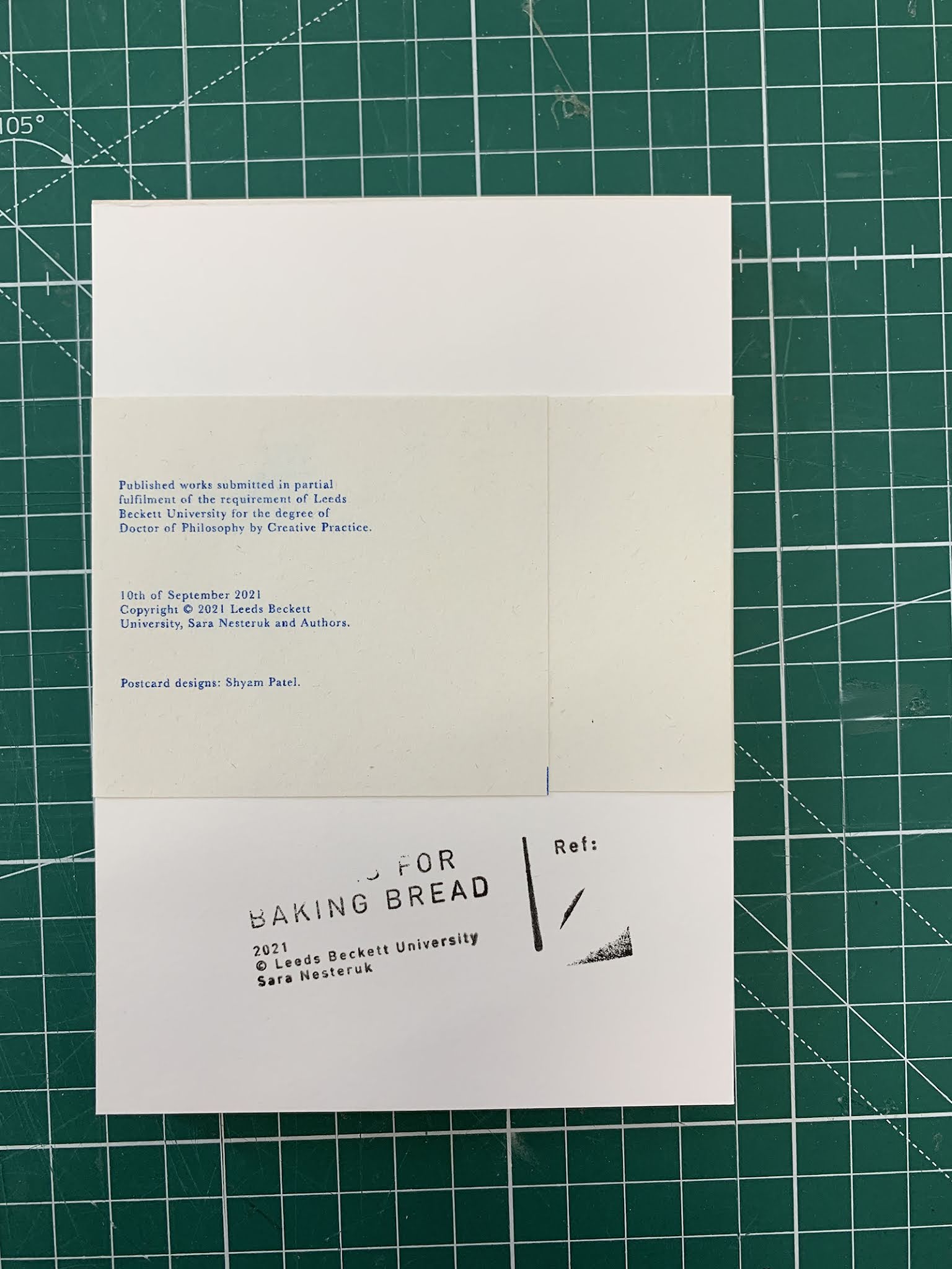
My final paper stocks are Gmund and Munken,
both from G. F. Smith. Gmund is a fantastic,
think, only 10 gsm thicker than tracing paper stock
at 80 gsm. This is almost opaque it is so dense
in its quality. Even my initial photocopy
postroom prints were beautiful in
this stock. My press room prints are gorgeous
and I am sold on this. This is my text for my
bibliographies and appendices section, and my
images throughout my whole book. I am using
SRA3 with bleeds throughout. My text is all
going to print on Munken. This is from
by Huddersfield print room and is also from
G. F. Smith. This is 100 gsm, thick, beautiful,
handable quality, pure white, it has an
academic and deep soul feel. My books go
into production next week and all prints go to
press on Tuesday and collation is on Thursday
and Friday.


Golden Section Layouts. Source: artist, information
from Bringhurst, 2005, p. 175).


Gmund and Munken Stock, Source: artist.


Grid, early tests, Source: Artist.


Images and grids, Source: Artist.


Final margins, Source: Artist.

Monday 23 August 2021

Research Supervision with Lisa

Monday 23rd August 2021
Fish, illusions scene, MC Escher, fasting,
Greek Orthodoxy, red eggs and cake
bread, recipes in Ukrainian and in English
intro and outro, Bullring, text and
blog, binding, concealed comb techniques,
external examiners, tea.


Saturday 21 August 2021

Thesis Production: Typesetting, Binding and Finals

Final production of my thesis is underway. My
body text is set in Baskerville. References for all
typesetting come from a brilliant book by Robert
Bringhurst, The Elements of Typographic Style
(2005). This includes analysis of visual harmonies,
uses of golden section in page proportions and a
relationship between musical intervals, page
structure, margins and page dimensions and ratios
(pp. 146–154). I am also using Bringhurst’s
analysis of typesetting for characters, special
characters, superscripts, uses of italics and
visual rhythms in page layout. Baskerville is a
historical typeface designed in Birmingham by
John Baskerville. An Eighteenth Century typeface.
I love this historical reference. There is a modern
typeface, Mrs Eaves, a development from Baskerville
and named after John Baskerville’s housekeeper,
lover and later wife. This is a contemporary version
or retake of Baskerville’s font with exquisite use
of ligatures.


The Elements of Typographic
Style Book Drawing, 2021, Source:
Author.


Mrs Eaves, 2021. Typesetting source: Author.


Comb binding holds together all my paper
stock. This includes different sizes, formats and
weights of paper. I am using a concealed comb
binding technique. Marc Atkinson of Land of
Plenty
recommended this to me. This is a
brilliant method including uses of one long
sheet of paper with three folds. To wrap a
front cover around itself, over its comb binding
and into a final back page. I am also binding
this back cover in on itself again, to hold
ephemeral materials at a back section of my
thesis.


The Arm Collective publication, n.d. Source:
Pinterest.


Paper Weights Spreadsheets, 2021, Source: Author.


Production Visuals, 20201, Source: Author.


Production Visuals, 2021, Source: Author.


Production Visuals, 2021, Source: Author.


I am now investigating postage options including
packaging and mailout envelopes. I want to
use a combination of raw, untreated brown card,
and shiny yellow G. F. Smith stock I am using for my
front cover. I am working on stickers, cover letters,
and how to use my Recipes for Baking Bread
stamp in branding all these materials. Next
stages are organising posting, postage times and
schedules for collating and production of print
materials.


How to makeup a Book Box, n.d. Source:
springpack.co.uk


Production Materials, 2021, Source: Author.


Production Materials, 2021, Source: Author.


References:
Bringhurst, R. (2005) The Elements of Typographic Style: Version 3.1. Point Roberts, Washington: Hartley & Marks.


Monday 16 August 2021

Research Supervision Meetings

Send posters to Simon, audio production,
Goodbye to Berlin, external examiners, paper
thickness and wire bindings, alternatives,
boxes, paper stocks, letters sections,
Cartographic Regressions, Forensic Architecture,
maps, Gareth Jones, audio, Phil Colley,
Serhii Plokhy, music, design and typesetting,
books, Ukrainian voice over artists, audio
recordings and double enders, voice over
artists and re-recordings, maps and visuals,
text and voice over, Instagram, Baskerville and
notes from Derek Horton, posters, Yana,
Zaporizhzhia, trips to Ukraine, Kyiv,
Situated motion graphics, green sections,
letters, auto-ethnographic research and an
author’s position, NAFAE, websites,
submissions and components, briefing options,
folded timelines, figures lists and page
numbers (priority task) ordering boxes,
zoom, post office, paper stocks and samples,
neatness and edges, prototypes and proofs,
simple and compromises and first choices,
MA teaching, ordering and glassine envelopes,
plans for next week, films one and three
complete with music, prototypes and proofs
complete.